
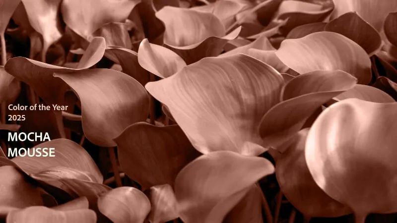
As the fashion industry evolves, color trends play a critical role in shaping brand identity and consumer behavior. The emergence of Mocha Mousse, selected as Pantone’s Color of the Year for 2025, presents opportunities for brands to connect emotionally with consumers. This article explores how incorporating Mocha Mousse can enhance branding strategies, resonate with consumer values, and align with important trends like sustainability. By understanding the psychological impact of color, marketers and designers can utilize this warm hue to create compelling narratives that foster trust and engagement with their audience.
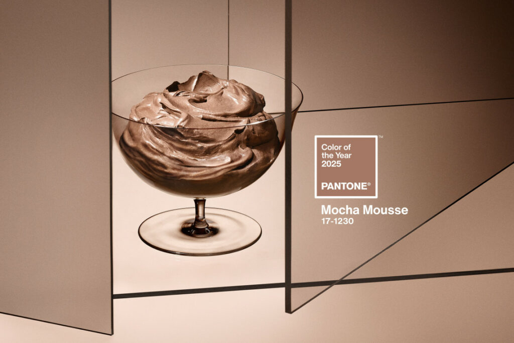
Table of Contents
Impact of Pantone 2025 on Fashion Trends
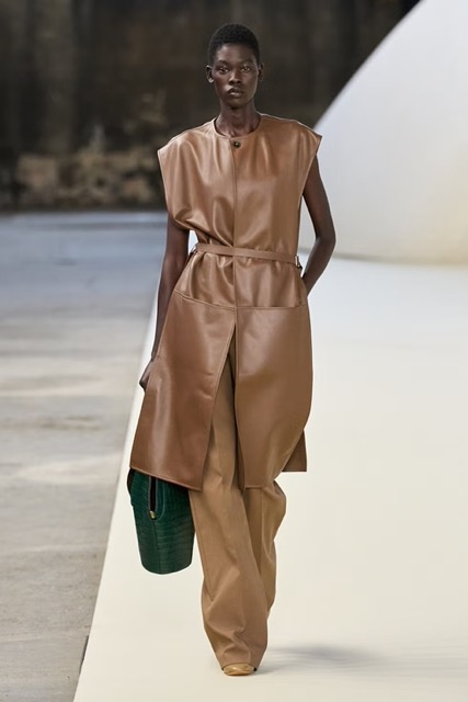
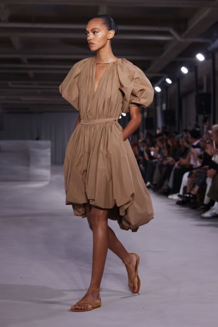
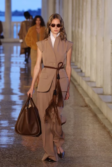
The world of fashion is inherently dynamic, constantly influenced by cultural shifts, technological advancements, and most notably, color trends. Each year, Pantone unveils a Color of the Year that serves not only as a trendsetter but also as a reflection of societal moods and aspirations. For 2025, Pantone has chosen the captivating Mocha Mousse, a rich and warm hue that promises to significantly impact fashion trends. In this exploration, we will delve into the multifaceted impact of Pantone 2025 on fashion, examining how it influences design, consumer behavior, and market trends.
1. Setting the Tone for Collections
Pantone 2025 is poised to become a pivotal tone around which many fashion designers will build their collections. The warmth and versatility of Mocha Mousse allow for various interpretations across different style genres, from bohemian to classic tailoring. Designers can incorporate this hue not only as a primary color but also as a complementary shade that adds depth to their palettes.
- Runway Influence: Expect to see Mocha Mousse dominating fashion weeks and runways globally, with designers using it in striking ensembles that encourage consumers to embrace this new shade.
- Seasonal Adaptations: The rich undertones can easily transition from spring/summer collections, where it may be paired with lighter pastels, to autumn/winter lines where it can be infused with darker hues like deep green or navy.
2. Evolution of Fabric Choices
The impact of Pantone 2025 extends beyond color selection; it also influences fabric choices. As designers aim to capture the mood of Mocha Mousse, expect innovations in textile manufacturing that enhance the color’s richness and texture. Fabrics that reflect light beautifully will become popular as they accentuate the warmth of this hue.
In particular, the following materials could see a rise in popularity:
- Silks and Satins: These materials will amplify the luxurious feel of Mocha Mousse, appealing to high-end fashion markets.
- Tweed and Wool Blends: For colder seasons, these fabrics can embody a cozy and chic aesthetic, perfect for layering in and out of the office.
3. Consumer Behavior Shifts
As Pantone 2025 captures the public’s imagination, we will likely witness shifts in consumer behavior as fashion enthusiasts look for ways to integrate Mocha Mousse into their wardrobes. Color psychology plays a crucial role here — the warm, earthy tones of Mocha Mousse can evoke feelings of comfort, stability, and sophistication.
Fashion brands will need to adapt by offering:
- Mix-and-Match Collections: To encourage consumers to invest, brands may curate collections that feature Mocha Mousse prominently among mixable items across various categories, from casual wear to formal attire.
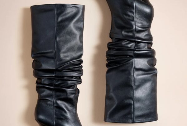
- Accessories and Statement Pieces: Designers might focus on creating standout items, such as bags and shoes in Mocha Mousse, which can be quickly embraced by consumers looking to refresh their look.
4. Sustainability and Ethical Fashion Trends
The rise of Pantone 2025 may also intersect with the growing emphasis on sustainability in fashion. As consumers become increasingly conscious of their purchase decisions, brands that adopt Mocha Mousse can pursue eco-friendly practices, such as using organic dyes and sustainable materials that resonate well with this color palette.
This approach not only reflects brand values but also connects with consumers on a deeper level, enhancing emotional ties to the products they choose. As a result, the fashion industry may initiate:
- Collaborations with Eco-Conscious Brands: Brands that prioritize sustainability may team up to create capsule collections featuring Mocha Mousse.
- Awareness Campaigns: Marketing initiatives showing the environmental benefits inherent in the production of items reflecting this new hue will encourage brand loyalty.
With Pantone’s selection of Mocha Mousse, a colorful transformation in the fashion landscape is underway, urging designers and consumers alike to explore new possibilities within their wardrobes. As we continue to embrace the impact of this rich color, the response from the industry will undoubtedly unfold more captivating trends and styles that reflect our evolving tastes and values.
As the influence of Mocha Mousse expands, it will shape not only individual wardrobes but also the broader narrative of fashion for 2025 and beyond.
Emotional Influence of Color in Design
The impact of color on human psychology is profound and multifaceted, playing a crucial role in various aspects of design, including branding, interior design, and visual arts. Colors are not merely aesthetic choices; they evoke feelings, inspire moods, and can even alter perceptions. Understanding the emotional influence of color can elevate designs from the mundane to the extraordinary.
The Psychology of Color
Every color carries its own psychological associations and cultural meanings. This makes color selection a vital part of the design process. For example:
- Red: Often associated with passion, excitement, and energy, red can stimulate appetite and convey urgency, making it effective in marketing for food and entertainment.
- Blue: Evoking feelings of calm and trust, blue is frequently used in corporate branding to inspire feelings of reliability and stability.
- Warm colors (e.g., yellow, orange): These colors are energetic and cheerful, often used in designs aimed at evoking happiness and friendliness.
- Cool colors (e.g., green, purple): These tend to be soothing and peaceful, perfect for environments aimed at relaxation, such as spas and wellness centers.
Understanding these associations allows designers to tailor their color choices to elicit specific emotional responses in their audience. This is especially important in fields such as marketing, where emotions can drive consumer behavior.
Color Harmony and Emotional Effects
Color harmony plays a critical role in enhancing the emotional influence of color. Designers often utilize color theory principles—like complementary, analogous, and triadic color schemes—to create a balance that resonates emotionally with viewers. For instance:
- Complementary color schemes: Combining colors opposite each other on the color wheel, such as blue and orange, can create a vibrant look that stimulates excitement and energy.
- Analogous color schemes: These involve colors that are next to each other on the color wheel, like blue, green, and yellow, fostering a sense of harmony and tranquility.
- Monochromatic schemes: Utilizing variations of a single color can produce a sophisticated and cohesive look, often conveying elegance and simplicity.
By carefully constructing color schemes, designers can amplify the emotional impact of their designs, catering to the moods and feelings they wish to evoke.
The Cultural Context of Color
It’s essential to consider cultural differences when analyzing the emotional influence of color. For instance:
- In Western cultures, white is traditionally associated with purity and weddings, whereas in some Eastern cultures, it represents mourning and loss.
- Red signifies good fortune and happiness in Chinese culture, contrasting its association with danger in Western contexts.
- Green is often linked to environmental themes in many cultures, symbolizing growth and renewal.
Designers must be mindful of these cultural interpretations to ensure that their color choices resonate positively with their target audience, avoiding potential miscommunications or negative connotations.
Case Studies: Emotional Color Application
Examining how successful brands and projects harness the emotional influence of color can provide practical insights:
- Starbucks: The use of green in Starbucks branding evokes feelings of relaxation and connection to nature, enhancing the coffeehouse experience and inviting customers to linger longer.
- McDonald’s: The bold red and yellow color scheme stimulates appetite and attention, effectively attracting customers both in-store and through advertisements.
- Airbnb: The use of serene blue tones in their branding evokes feelings of trust and community, aligning with the service’s emphasis on unique local experiences.
These examples illustrate how strategic color choices can influence consumer perception and behavior, leading to more significant brand loyalty and engagement.
Conclusion
Understanding the emotional influence of color in design is critical for creating effective and compelling visual experiences. As designers integrate color into their projects, considering psychological, cultural, and harmonic aspects can significantly enhance the emotional connectivity of their work. From branding to interior design, the right colors can evoke desired emotions, leading to more profound interactions with audiences. As trends like Pantone 2025 unfold, keeping an eye on these emotional implications will be crucial in adapting designs that resonate with current and future audiences.
Integrating Pantone 2025 in Creative Projects
Pantone 2025 is an evocative color marked by its deep, rich hue that strikes a balance between boldness and sophistication. The integration of this dynamic shade into creative projects allows designers and marketers to create impactful visual narratives that resonate. Whether it’s in branding, fashion, or interior design, Pantone 2025 offers a wealth of opportunities to enhance projects and elicit emotional responses.
Embracing the Boldness of Pantone 2025 in Branding
Brands that opt to incorporate Pantone 2025 into their identity can thrive by harnessing its psychological symbolism. The color is often associated with power, sophistication, and vitality:
- Distinctive Identity: Utilizing Pantone 2025 can help a brand stand out in a crowded market, creating a memorable visual identity.
- Emotional Connection: The bold nature of this hue draws attention and fosters an emotional response, often promoting feelings of confidence and energy in consumers.
- Versatile Applications: From logos to packaging, integrating this color in various design elements keeps the brand fresh and aspirational.
Brands like Nike or Toyota often leverage similar bold colors in their marketing campaigns, showcasing how a well-chosen color can underscore their brand ethos while appealing to their target audience.
Using Pantone 2025 in Fashion Design
The fashion industry continuously seeks new ways to innovate and inspire creativity. Integrating Pantone 2025 into fashion collections can captivate audiences with its luxurious undertones:
- Seasonal Collections: Designers can introduce Pantone 2025 in fall and winter collections to convey warmth during the colder months, pairing it with textures like velvet and wool for added depth.
- Accessories and Accents: This color works beautifully in accessories; a deep red bag or a scarf can serve as a statement piece that elevates an entire outfit.
- Runway Impact: In runway shows, the color can command attention, especially when paired with contrasting shades or used in dramatic displays to create visual interest.
Interior Design Inspirations with Pantone 2025
When it comes to interior design, Pantone 2025 can transform spaces into vibrant havens. Here are some innovative approaches to using this color:
- Feature Walls: A feature wall painted in Pantone 2025 can act as a stunning focal point, especially when complemented with lighter colors.
- Furniture and Upholstery: Incorporating this hue in furniture, such as chairs and sofas, can add a touch of modern elegance to both contemporary and traditional settings.
- Accent Decor: Use Pantone 2025 sparingly in small decor items, like cushions or vases, to introduce pops of color without overwhelming the space.
Interior designers seeking to capitalize on this color can explore successful case studies showcasing its integration. For instance, many designers have drawn inspiration from the aesthetics seen in Apartment Therapy, showcasing how tones like Pantone 2025 can harmonize with various design styles.
Color Combinations to Elevate Pantone 2025
When working with Pantone 2025, consider pairing it with complementary colors to enhance its impact:
- Soft Neutrals: Shades like cream or beige can balance the boldness of Pantone 2025, creating a harmonious aesthetic.
- Vibrant Contrasts: Jewel tones such as emerald or cobalt blue can provide exciting contrasts that make Pantone 2025 pop, especially in fashion and interior design.
- Earthy Undertones: Integrating earthy tones can evoke a natural, grounded feeling that contrasts the dynamic energy of Pantone 2025.
As creatives embrace Pantone 2025, the key is not just in its application but in the understanding of its emotional resonance. This color signifies confidence and sophistication, all while providing versatility across creative projects. By strategically incorporating Pantone 2025, designers and brands can create memorably engaging experiences that resonate deeply with their audiences.
Predictions for Pantone 2025 in Brand Identity
As we look forward to 2025, the anticipated Pantone Color of the Year, Mocha Mousse, is set to make a substantial impact on brand identity. This warm, earthy hue is not just a color; it’s a powerful tool for businesses seeking to connect emotionally with their audience. As companies align their branding strategies with current trends and consumer preferences, the application of Pantone 2025 will be pivotal in shaping identities that resonate on multiple levels.
The Emotional Depth of Mocha Mousse
The emotional influence of color in branding cannot be overstated. Mocha Mousse evokes feelings of warmth, security, and approachability. Brands that embrace this color can convey a message of reliability and sophistication, key traits that consumers often seek. For example, brands in the wellness and sustainability sectors may find that this color can enhance their identity by echoing themes of natural beauty and earthiness.
- Warmth and Comfort: Mocha Mousse symbolizes a retreat into nature, providing a comforting background that can help brands forge a closer connection with their consumers.
- Trust and Stability: As a neutral tone, it fosters feelings of stability, making it a popular choice for brands aiming to project reliability.
- Versatility: The adaptability of Mocha Mousse across various applications—from logos to marketing materials—further reinforces its appeal in brand identity enhancement.
Integration of Mocha Mousse in Brand Strategies
Integrating Mocha Mousse into brand identity requires a holistic approach. Businesses will need to consider how this color fits into their existing branding frameworks and overall messaging. Here are some strategic insights:
- Visual Identity: Rebranding efforts might involve updating logos and packaging to incorporate Mocha Mousse, thus ensuring that the visual elements reflect the warmth and reliability of the color. Brands should explore Pantone’s Color of the Year resources for guidance on effective integration.
- Marketing Campaigns: Creative marketing initiatives can utilize Mocha Mousse in imagery and typography, leveraging its emotional resonance to connect with target audiences.
- Collaborations and Partnerships: Brands can collaborate with influencers and artists who embody the values represented by Mocha Mousse, thereby amplifying their reach and strengthening brand identity through shared aesthetics.
Sector-Specific Applications
The implications of adopting Mocha Mousse in branding extend across various industries:
- Food and Beverage: Restaurants and cafes can utilize Mocha Mousse in their interior design and branding materials to create a cozy, inviting atmosphere that mirrors their culinary offerings.
- Fashion and Beauty: In the fashion realm, clothing lines and beauty products may adopt this color to evoke timeless elegance, appealing to a consumer base that values quality and sophistication.
- Home Decor: Brands in the home decor sector could leverage Mocha Mousse to create designs that resonate with consumers’ longing for comfort and warmth within their living spaces.
Future Trends and Considerations
As we approach 2025, the challenge for brands will be to assess how Mocha Mousse not only complements their existing identity but also how it can set them apart in an evolving market. Key considerations should include:
- Consumer Trends: Understanding consumer sentiment and preferences towards warmer, earthy tones will be essential to crafting a relevant identity.
- Sustainability: The move towards eco-friendliness continues to rise, and brands that incorporate Mocha Mousse in a sustainable way may grow stronger connections with environmentally conscious consumers.
- Digital Presence: In today’s digital landscape, brands must ensure that their use of Mocha Mousse translates well across online platforms, maintaining vibrancy and appeal across different mediums.
In conclusion, brands that effectively anticipate and utilize the emotional and visual opportunities presented by Mocha Mousse will likely thrive in 2025. This warm, inviting color serves as an ideal backdrop for messaging that emphasizes trust, comfort, and sophistication, creating a lasting impact on brand identity.
The emergence of Pantone’s Mocha Mousse as the Color of the Year 2025 signifies a pivotal shift in the fashion and branding landscapes, emphasizing warmth, stability, and sophistication. Brands are encouraged to adapt by curating mix-and-match collections and creating standout accessories that incorporate this earthy hue. As sustainability remains a priority, companies should explore eco-friendly practices and collaborations that resonate with environmentally conscious consumers, reinforcing emotional connections through their products.
For effective integration of Mocha Mousse into brand identity, businesses should update visual elements such as logos and marketing materials to reflect the color’s comforting qualities. Understanding consumer trends, especially the growing preference for earthy tones, will be essential in crafting relevant brand messages. Additionally, focusing on sustainability and ensuring digital presence aligns with the color’s appeal will help brands build lasting connections and stand out in a competitive market.